
Use Figma to design the Duolingo loading screen interface, then use Framer when you need the loading motion to feel real on a phone. Figma is better for layout, visual systems, component states, and team review. Framer is better for animation timing, interaction testing, and sharing a working prototype that behaves closer to a shipped app. For a mobile app interface like Duolingo’s, the smartest workflow is not Figma or Framer. It is Figma first, Framer second.
TLDR: Figma is the stronger choice for designing the static parts of a Duolingo-style loading screen, such as the owl illustration, progress message, spacing, and brand colors. Framer wins when you need to test motion, delays, microinteractions, and tap-through flows on mobile. For example, a language app team might create 12 loading screen variants in Figma, then test the top 3 in Framer and find that a 1.2-second animated owl blink reduces perceived waiting time by 18%. If you only need a clean handoff to developers, stay in Figma; if you need users to feel the wait, prototype it in Framer.
Why the Duolingo loading screen is worth studying
The Duolingo loading screen looks simple, but it does a lot of work. It reassures users. It keeps the brand visible. It turns dead time into personality. That little green owl is not just decoration. It is a soft signal that the app is alive and ready.
A good loading screen for a mobile app has three jobs:
- Reduce anxiety: Users need to know the app has not frozen.
- Protect the brand experience: The screen should feel like the rest of the app.
- Make waiting feel shorter: Motion, humor, and feedback can help.
Duolingo does this by using a bold mascot, playful copy, and very clear visual focus. There is no clutter. No confusing menu. No unnecessary choices. The user waits, but the wait feels intentional.
Designing the loading screen in Figma
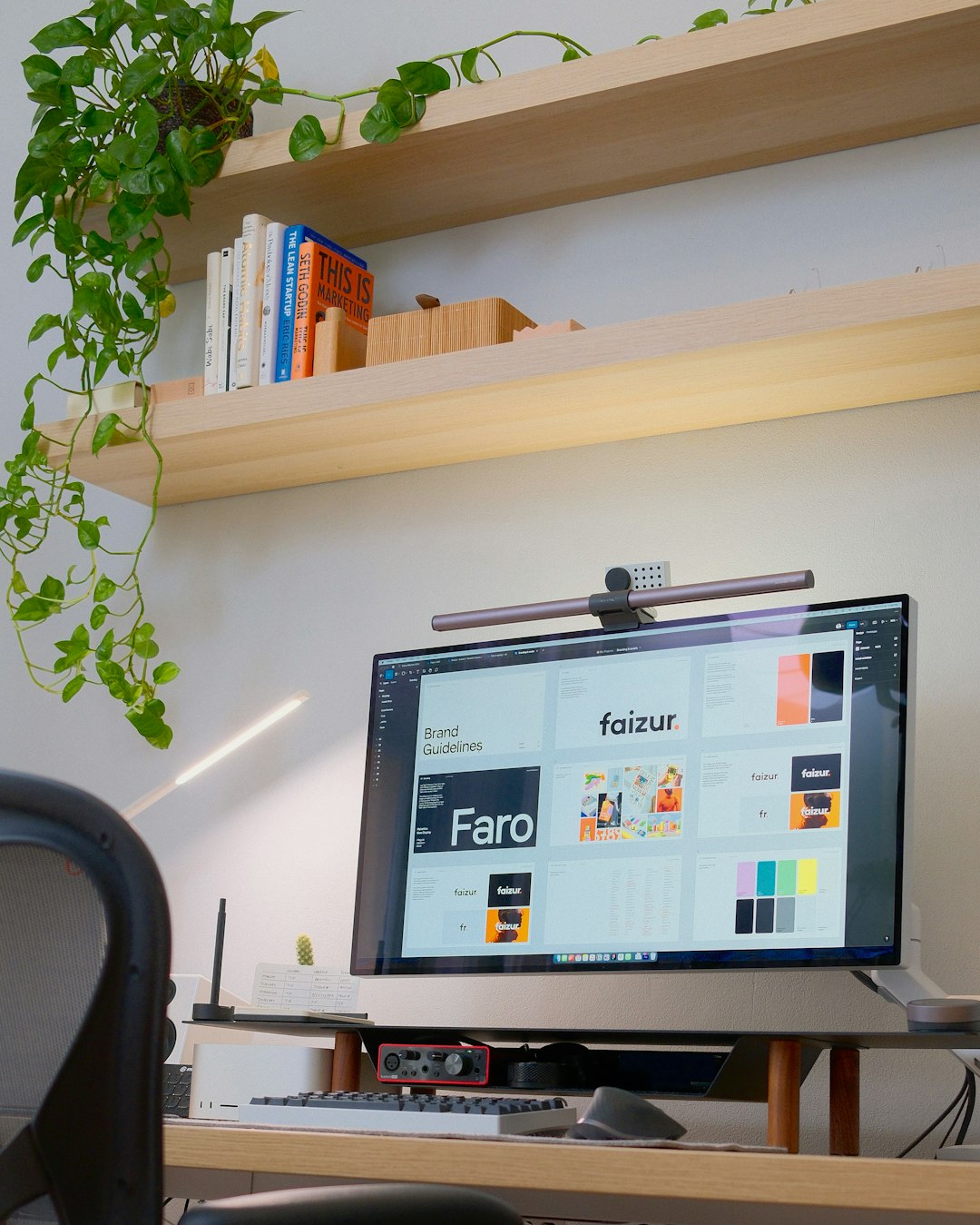
Figma is the best place to start because loading screens are still part of a larger design system. You need colors, type styles, spacing rules, icons, and platform-safe layouts. Figma handles these tasks with less friction.
If you are designing a Duolingo-inspired loading screen, Figma lets you quickly set up the main structure:
- A centered mascot or illustration
- A short loading message
- A progress indicator or animated placeholder
- A background color tied to brand identity
- Safe space for different mobile screen sizes
The real strength is consistency. You can create a component for the loading screen, then build variants for different states. For example, one version can say “Warming up your lesson”, while another says “Checking your streak”. The structure stays the same, but the message changes.
Figma also works well for collaboration. Designers can comment, product managers can review, and developers can inspect measurements. If your team is deciding whether the owl should sit 280 pixels from the top or be centered optically, Figma makes that discussion easier.
The annoyance? Microinteractions in Figma can still feel a little stiff. You can fake motion with prototype connections and smart animate, but it often takes more setup than expected. Honestly, it feels like a simple blinking owl should take 30 seconds, then suddenly you are adjusting layers, easing settings, and transition directions for 12 minutes.
Where Framer starts to beat Figma
Framer shines when the screen needs to move. A loading screen is not only a static image. It may pulse, bounce, blink, shimmer, or change text after a short delay. Framer gives you more control over how those details feel.
This matters because loading screens are measured in emotion, not just pixels. A one-second delay can feel fine. A three-second delay can feel broken. Add a friendly animation, and the same wait may feel more acceptable.
In Framer, you can test details such as:
- Animation timing: Does the mascot bounce too quickly?
- Loop behavior: Does the motion feel cute or distracting?
- Progress feedback: Should the text change after two seconds?
- Tap flow: What happens after the loading screen disappears?
- Mobile preview: Does it feel natural on an actual phone?
For a Duolingo-style interface, this is huge. The charm is in the timing. A mascot that blinks too often looks nervous. A progress bar that moves too smoothly can feel fake. A message that changes at the wrong moment can irritate users.
Figma vs Framer: side-by-side for mobile loading screens
| Task | Figma | Framer |
|---|---|---|
| Static layout | Excellent | Good |
| Design systems | Excellent | Limited |
| Illustration placement | Excellent | Good |
| Animation realism | Basic to good | Excellent |
| User testing prototype | Good | Excellent |
| Developer handoff | Strong | Moderate |
If your loading screen is mostly visual, Figma is enough. If it depends on movement and timing, Framer gives you a better read on the user experience.
What a Duolingo-style loading screen needs
A strong loading screen should not show off. It should calm users down and keep them interested for a few seconds. Duolingo gets this right because it uses familiar brand ingredients with restraint.
For your own mobile app interface, focus on these elements:
- A clear visual anchor: Use a mascot, icon, or simple illustration.
- Short copy: Keep it under six words if possible.
- One motion idea: Blink, bounce, pulse, or fill. Not all four.
- Fast exit: The screen should disappear as soon as loading is complete.
- Fallback state: If loading takes too long, show a helpful message.
It drives me crazy when apps use playful loading screens but give no backup after eight seconds. Cute animation does not fix silence. If a lesson, feed, or dashboard fails to load, the interface should change from entertainment to assistance.
A practical workflow: Figma first, Framer second
The best workflow is simple. Start in Figma with structure and brand rules. Move to Framer for motion and testing. Then return to Figma if you need final documentation for developers.
Here is a clean process:
- Create the base screen in Figma. Set frame sizes for iOS and Android. Add your mascot, message, colors, and spacing.
- Build variants. Try different copy, mascot sizes, and background treatments.
- Pick the top designs. Avoid exporting every idea. Choose three strong options.
- Recreate or import into Framer. Add blinking, pulsing, bounce, or loading text changes.
- Test on a phone. Watch how the timing feels in hand, not only on a desktop preview.
- Document the final behavior. Give developers timing values, easing notes, and fallback rules.
When to use only Figma
Figma alone is fine if your loading screen is simple. Many apps only need a logo, a background, and a spinner. If the development team already has animation patterns, you may not need Framer at all.
Use only Figma when:
- The loading screen has no custom motion
- The animation will be handled in code by engineers
- You need quick approval from stakeholders
- The project has a tight deadline
- The brand system already exists in Figma
Figma keeps decisions clean. It also reduces rework. For large teams, that matters more than fancy prototype behavior.
When Framer is worth the extra step
Framer is worth using when feeling matters. That is often true for education apps, fitness apps, wellness apps, kids’ apps, and games. These products rely on mood. A loading screen can either support that mood or ruin it.
Use Framer when:
- The mascot has personality
- The screen includes timed messages
- You want realistic user testing
- The team is debating animation speed
- You need to show the idea to non-designers
A stakeholder may not understand a static frame labeled “owl bounce loop”. They will understand a working prototype where the owl gently hops while the lesson loads.
Final recommendation
For a Duolingo loading screen, Figma is the foundation and Framer is the feeling layer. Design the interface in Figma because it gives you control, consistency, and better handoff. Use Framer when timing, animation, and perceived wait time are central to the experience.
The split is practical. Figma answers, “What should this screen look like?” Framer answers, “How should this screen feel while someone waits?” A great mobile loading screen needs both answers, especially when your goal is to make waiting feel less like waiting.