
Great slides can make a room lean forward. Bad slides can make people check their phones. The good news is simple. Today’s presentation software can help almost anyone build clean, sharp, and professional slides. You do not need to be a designer. You just need the right tool, a clear message, and a few smart habits.
TLDR: Modern presentation software helps you make better slides fast. It offers templates, smart layouts, brand kits, icons, charts, and AI writing help. For example, a small sales team can turn a 40-minute design task into a 10-minute slide update by using saved templates and auto-formatting. If your team makes 20 decks a month, that can save almost 10 hours of work.
Why Professional Slides Matter
A presentation is not just a file. It is a first impression. It can sell an idea. It can explain a plan. It can win trust.
When slides look messy, people may think the message is messy too. That is not fair. But it happens.
Professional slides do three things well:
- They guide the eye. People know where to look.
- They feel clear. The message is easy to follow.
- They build trust. The speaker looks prepared.
The best presentation software helps with all three. It turns blank-slide panic into “I can do this.”
What Makes Presentation Software Feel Professional?
Good presentation software does not just give you a blank canvas. It gives you a head start. It helps you avoid common design mistakes, like tiny text, crowded charts, and random fonts.
Here are the features that make a big difference.
1. Smart Templates
Templates are like recipe cards for slides. They show you where the title goes. They suggest where to place images. They balance text and space.
A strong template can make a simple idea look polished. It can also keep every slide in the same style. That matters a lot in business, school, marketing, and training.
Look for templates that include:
- Title slides
- Agenda slides
- Team slides
- Data slides
- Timeline slides
- Closing slides
That way, you are not inventing each slide from zero.
2. Easy Brand Controls
Brand controls help your slides stay consistent. You can set colors, fonts, logos, and layouts once. Then the software keeps everything in line.
This is very helpful for teams. One person may love purple. Another may use seven fonts. A brand kit says, “Nice try, but let’s stay professional.”
It keeps the deck from looking like a yard sale.
3. AI Design Suggestions
Many modern tools now include AI features. These can suggest layouts, rewrite text, create images, or organize content.
This can be a great helper. But it should not be the boss. You still decide what matters.
For example, you can paste a long paragraph into a slide. AI can turn it into three bullet points. That is useful. Nobody wants to read a novel during a quarterly update.
4. Simple Chart Tools
Data can be powerful. It can also be painful.
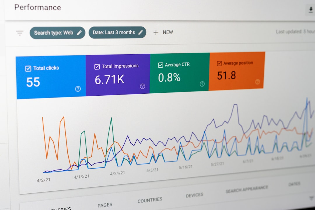
Professional presentation software makes charts easier to build. You can add bar charts, line charts, pie charts, and simple dashboards. You can also change colors and labels quickly.
The goal is not to show every number. The goal is to show the right number.
If sales grew by 28%, make that clear. If customer wait time dropped from 12 minutes to 4 minutes, show it proudly. Big wins should not hide in tiny tables.
The Secret: Less Is More
Presentation software can do many things. It can animate text. It can spin logos. It can make objects fly across the screen like they missed a train.
Please use these powers wisely.
Professional slides are usually simple. They use space. They do not scream. They do not pack 90 words onto one slide.
Use this easy rule:
- One slide. One main idea.
- One chart. One key message.
- One image. One clear mood.
If a slide has too much content, split it into two slides. Your audience will thank you. Their eyes will also thank you.
Features That Save Time
Professional does not have to mean slow. The best tools help you move fast.
Here are time-saving features worth looking for:
- Drag and drop editing: Move things without fighting the software.
- Auto alignment: Keep boxes, images, and text lined up.
- Reusable slide blocks: Save sections you use often.
- Collaboration: Let teammates comment and edit together.
- Version history: Go back if someone “improves” the deck too much.
- Export options: Save as PDF, video, or shareable link.
These features may sound small. They are not. If each one saves two minutes per slide, a 25-slide deck can save almost an hour.
How to Make Any Slide Look Better
You can use the fanciest software in the world and still make a confusing slide. So here are some easy design rules.
Use Big Text
If people cannot read it, it does not exist. Use large titles. Keep body text short. Aim for simple words.
Pick Two Fonts
One font for headings. One font for body text. That is enough. More fonts can make the deck feel messy.
Use Strong Contrast
Dark text on a light background works. Light text on a dark background works. Pale gray on white does not work. It whispers. Slides should speak.
Give Things Room
Empty space is not wasted space. It helps people focus. It makes slides feel calm and expensive.
Use Images With Purpose
A good image can explain a mood fast. A random stock photo of people pointing at glass may not help. Choose images that support the message.
Who Benefits Most?
Almost everyone who shares ideas can benefit from better presentation software.
- Sales teams can build pitch decks faster.
- Teachers can make lessons more visual.
- Startups can impress investors.
- Managers can make updates easier to understand.
- Students can make projects look sharp.
- Marketers can keep campaigns on brand.
Imagine a product manager named Mia. She needs to explain a new app feature in Monday’s meeting. She has notes, screenshots, and customer feedback. Instead of building from scratch, she opens a ready-made product update template. She adds three screenshots, one chart, and five short bullet points. In 30 minutes, she has a clean deck. Her team understands the plan. The meeting ends early. Everyone gets coffee. A small miracle.
Common Slide Mistakes to Avoid
Even great tools cannot save every slide. Some mistakes are classic. They appear everywhere, like office printers that jam before important meetings.
Avoid these:
- Too much text: Slides are not documents.
- Tiny charts: If numbers matter, make them readable.
- Random colors: Pick a palette and stay with it.
- Too many animations: Motion should help, not distract.
- Weak titles: Use titles that explain the point.
Instead of a title like “Results”, write “Customer Signups Grew 32% in Q2.” That tells the story right away.
Choosing the Right Tool
The best presentation software is the one you will actually use. It should feel easy. It should match your work style. It should help you create, not slow you down.
Before choosing, ask these questions:
- Does it have modern templates?
- Can my team work in it together?
- Can I use brand colors and fonts?
- Does it handle charts well?
- Can I export and share easily?
- Does it save time on repeated tasks?
If the answer is yes, you are in good shape.
Final Thoughts
Professional slides are not about decoration. They are about communication. They make ideas easier to understand. They help audiences stay focused. They make speakers look confident.
Presentation software can do a lot of the heavy lifting. It can guide your layouts. It can clean up your design. It can help with charts, text, images, and teamwork.
But the real magic is still your message. Keep it clear. Keep it simple. Use the tool to make your idea shine.
Because when every slide looks professional, people pay attention. And when people pay attention, your ideas get a real chance to win.