
Ibis Paint X is a powerful mobile drawing app that offers a wide range of features suited for digital artists at any level. Whether you’re illustrating characters, designing graphics, or working on a comic, achieving color consistency can sometimes be a challenge. With so many tools and layers to work with, keeping your colors uniform across illustrations and even within a single project requires a bit of strategy and practice.
TL;DR (Too Long; Didn’t Read)
To make colors more consistent in Ibis Paint X, use features like color palettes, reference layers, and the eyedropper tool effectively. Grouping layers and naming them correctly helps manage color zones. Adjustment layers and exporting palettes also play a big role in keeping looks uniform. Don’t forget to save and reuse palettes for future work.
Why Color Consistency Matters
Maintaining consistent colors is crucial when you’re designing a brand, creating a comic with repeating characters, or building a portfolio. Inconsistent colors can make a work feel jarring or unprofessional. Fortunately, Ibis Paint X includes several tools and settings to help you achieve professional-level color alignment across your project.
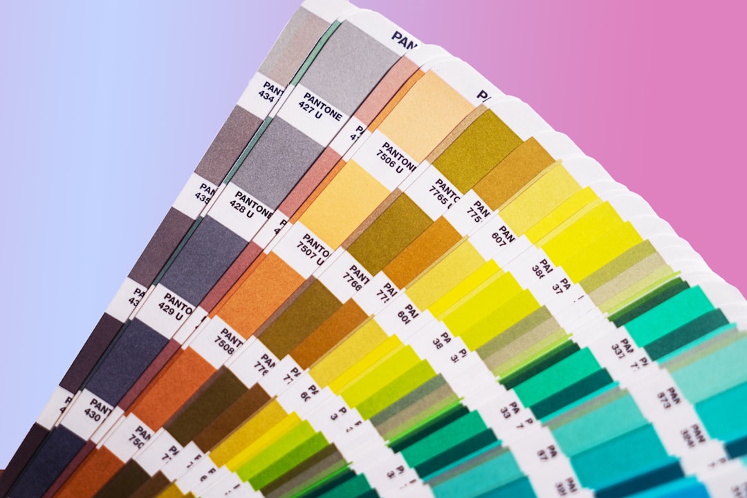
1. Use the Custom Color Palette Feature
One of the most effective ways to maintain consistent colors is to create a custom color palette. Ibis Paint X allows you to generate and save these palettes for each project.
- Go to the color wheel located at the bottom of the screen.
- Tap the Color Palette icon (resembles a small color grid).
- Select “+ Add New Palette” and give it a recognizable name like “Character Colors” or “Comic Episode 1.”
- As you find the perfect tones, tap the heart icon to save them into your palette.
This way, every time you start a new layer or a new drawing, your custom colors are a tap away.
2. Use the Eyedropper Tool Strategically
One of the simplest yet most underused tools is the eyedropper. It’s critical when ensuring you’re reusing the exact same color rather than trying to match it visually.
- Hold your finger (or stylus) down on the color you want to reuse.
- The eyedropper will automatically activate and pick that color.
- Make sure to turn off features like “Color Dynamics” that might subtly alter your hues while painting.
Also, ensure you’re sampling from the correct layer or use the “Sample from all layers” setting if necessary.
3. Keep Backgrounds and Environments on Separate Layers
Color contamination often happens when you apply shading or lighting across merged elements. By separating your background, character, and foreground onto distinct layers, you prevent hue blending and make it easier to apply adjustment filters to just one color group.
Organize your layers into folders such as:
- Character Base
- Shading
- Background Elements
- Lighting Effects
This structure helps you make targeted edits and ensures that one adjustment won’t throw off the rest of your color scheme.
4. Use Reference Layers and Masking
In complex illustrations, working with reference layers can help you maintain proper color zones. When a layer is set as a reference, other tools—like bucket fill or linework-guided coloring—will look at the outlines or color zones of that layer.
To set a reference layer:
- Go to the layer panel.
- Tap the layer you want to set.
- Select “Reference” from the layer options.
You can then use masks on new layers to ensure shading and color overlays stay within the designated space. This keeps the colors consistent and separated across different components of the illustration.
5. Lock Alpha for Efficient Shading
The Alpha Lock feature is your best friend when you’re trying to shade consistently without coloring outside the intended area. When this is turned on, you can only paint on the already painted pixels of the layer.
This makes adding highlights or shadows more precise and ensures that you don’t accidentally add unwanted hues on unused parts of the layer.
6. Adjustment Layers and Filters
Sometimes, your base colors are good, but the lighting or contrast may create dissonance across your artwork. That’s where adjustment layers come into play.
Steps to add an adjustment layer:
- Tap the Layer menu
- Select “Filter” then choose options like “Hue/Saturation,” “Brightness/Contrast,” or “Color Balance.”
Adjustment layers help you correct tone inconsistencies without permanently altering your original artwork. Apply them above a grouped folder layer for full-scene correction or to individual elements.
7. Export and Share Palettes for Future Projects
If you’re working on a comic series or a brand-based project, exporting your palette ensures that you maintain color integrity across multiple sessions and even across devices.
To export a palette:
- Go to the color palette panel
- Select the palette you want
- Tap the “Share” icon to export it as an image or code
You or a collaborator can import this on another device, ensuring everyone is working from the same color base.
8. A Few Advanced Tips
Use the Ruler and Grid Tools: Even though it sounds unrelated, using gridlines can help you maintain consistency, especially when you’re evenly distributing colored shapes or zones.
Disable Color Dynamics: This setting can change the hue or saturation dynamically based on pen pressure or speed. While creatively useful, it risks color inconsistency if not carefully managed.
Keep a Reference Image in the Canvas: Add a layer containing your references and lower its opacity. You can use this to sample exact shades continually without switching apps.
Conclusion
Color consistency in Ibis Paint X is not just achievable but can be mastered with a thoughtful workflow and consistent use of the app’s tools. By investing just a little time to set up palettes, organize layers correctly, and make use of features like the eyedropper, alpha lock, and reference layers, you can drastically improve the visual continuity of your art.
Whether you’re a hobbyist or an aspiring pro, these small changes will elevate your workflow, making your creativity shine—uniformly and beautifully.