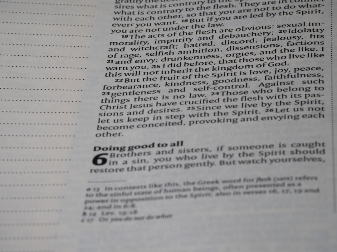
Great typography feels invisible. It guides your eyes. It reduces effort. And it makes reading feel smooth and enjoyable. The good news? You do not need to be a designer to improve it. There are small, hidden typography tools that can boost readability by up to 25% or more when used correctly.
TLDR: Small typography tweaks can dramatically improve readability. Tools like line height control, proper line length, font pairing, contrast adjustment, and spacing optimization reduce eye strain and improve focus. Many of these tools are built into common design and writing platforms. Use them wisely, and your content becomes easier, faster, and more enjoyable to read.
Let’s explore 7 hidden typography tools that can instantly improve readability. Keep it simple. Apply one at a time. You will see the difference.
1. Line Height Adjuster (Leading Control)
Line height is the space between lines of text. It sounds small. But it changes everything.
When lines are too close, your eyes feel cramped. When they are too far apart, your brain struggles to connect them. The magic usually lives between 1.4 and 1.6 line height for body text.
Many writing tools hide this setting in paragraph formatting. Look for “line spacing” or “leading.”
- Too tight: Hard to scan.
- Too loose: Breaks reading flow.
- Just right: Smooth and effortless.
This one adjustment alone can increase reading speed significantly. It reduces visual fatigue. And it keeps readers on your page longer.

2. Optimal Line Length Setting
Ever read a website where the text stretches across the entire screen? Painful.
The ideal line length is between 50–75 characters per line. That includes spaces.
Why does this matter?
Your eyes move in jumps, called saccades. If a line is too long, your eyes struggle to find the next line. If it is too short, your reading rhythm breaks.
Many website builders hide this inside:
- Content width
- Text container size
- Margin controls
Adjust the width of your text box. Not the font size. This small trick dramatically improves readability.
Shorter lines mean:
- Better focus
- Less eye strain
- Higher comprehension
3. Smart Font Pairing Tools
Not all fonts work well together. Some compete. Some clash. Some confuse the eye.
Hidden inside many design platforms are font pairing suggestions. Use them.
A simple rule:
- Use one font for headings
- Use one font for body text
- Avoid using more than two or three total
Great combinations often pair:
- Serif + Sans Serif
- Bold Headings + Neutral Body Text
Why does this help?
Contrast creates structure. Structure improves scanning. And scanning improves comprehension.
Fonts should not distract. They should disappear behind the message.
4. Micro Letter Spacing (Tracking Control)
This is a hidden gem.
Letter spacing, also called tracking, adjusts the space between characters. Most people never touch it.
But it matters. Especially for:
- ALL CAPS text
- Headings
- Small font sizes
When letters are too close, words blur together. When slightly spaced out, they breathe.
For uppercase headings, add a little spacing. Around 0.05em to 0.1em can work wonders.
It creates elegance. It improves clarity. And it adds subtle professionalism.

5. Color Contrast Checkers
Poor contrast destroys readability.
Light gray text on a white background may look stylish. But it is hard to read. Especially on mobile.
Hidden inside many design tools are accessibility contrast checkers. They measure the ratio between text and background color.
Aim for:
- 4.5:1 contrast ratio for body text
- 3:1 for large text
Good contrast results in:
- Less squinting
- Better accessibility
- Longer reading sessions
This is not just design preference. It affects users with visual impairments. And it impacts mobile users in bright environments.
High readability is inclusive design.
6. Margin and Padding Controls
White space is not empty space. It is breathing room.
Margins are the space outside elements. Padding is the space inside elements.
When text touches the edge of a screen, it feels cramped. When surrounded by space, it feels calm.
Increase padding around text blocks. Add more spacing between paragraphs. Let your content breathe.
Good spacing creates:
- Visual hierarchy
- Clear separation of ideas
- Lower cognitive load
Readers should never feel claustrophobic while reading.

7. Hierarchy Builders (Heading Structure Tools)
This tool is often ignored.
Heading levels are not just for size. They create structure.
Use:
- H1 for your main title
- H2 for main sections
- H3 for subsections
Do not skip levels randomly. Structure helps both readers and search engines.
Good hierarchy allows readers to:
- Scan quickly
- Find key information
- Understand content flow
Add subtle size differences. Add spacing before headings. Make sections visually clear.
When readers can scan first, they are more likely to read deeply.
Bonus: Readability Preview Modes
Here is an extra tip.
Many tools offer preview modes. Desktop. Tablet. Mobile.
Always check mobile typography.
Text that looks perfect on a laptop may feel tiny on a phone. Or lines may become too long. Or spacing may feel off.
Quick checklist:
- Is the font at least 16px for body text?
- Are buttons easy to tap?
- Are paragraphs short?
Small screens amplify typography mistakes.
Why These Small Changes Add Up
Each change seems minor.
But together, they reduce:
- Eye strain
- Cognitive friction
- Reading fatigue
And they increase:
- Reading speed
- Comprehension
- Engagement time
When readers do not struggle with text layout, they focus on the message.
That is the true goal of typography.
A Simple Action Plan
Do not overhaul everything at once.
Follow this simple order:
- Adjust line height to 1.5.
- Limit line length to 50–75 characters.
- Improve contrast.
- Add breathing room with margins.
- Refine heading hierarchy.
- Test letter spacing in headings.
- Check mobile readability.
Spend 30 minutes. That is enough.
You will notice smoother reading immediately.
Typography Is Invisible Design
The best typography is not flashy. It does not shout. It supports.
When typography works, readers forget it exists.
They simply read.
And that is powerful.
Improving readability by 25% does not require fancy software. It requires attention to spacing, structure, contrast, and flow.
These hidden tools are already built into most platforms. You just need to use them intentionally.
Start small. Adjust one setting today. Your readers will feel the difference. Even if they cannot explain why.
That is the magic of smart typography.
